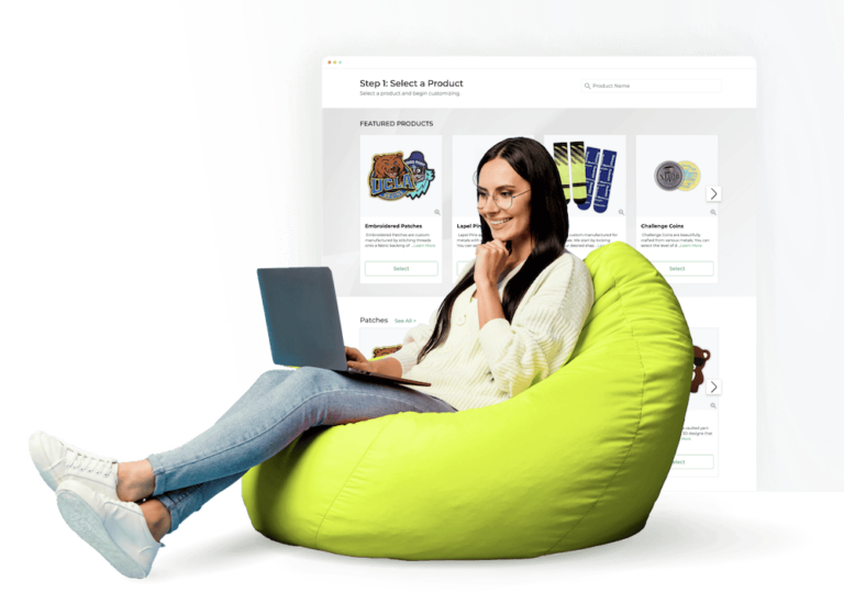
The Progress Of Our New Logo
As I mentioned in a previous blog, we have embarked on a project to redo our company’s entire branding. It started off as a simple project to redo our website. We have had significant growth in the past few years and we have matured tremendously as a company; we wanted a website that reflected that growth and maturity as well as future ambitions. So I commissioned the services of the graphic designer that did our logo to redo our website – and as soon as he did the first draft I realized that it wasn’t what we were looking for.
It was definitely nicer than the website that we have now, and far better than our competitors’ websites. But it was just that – a better version of our current website and a superior version of our competitors’ sites. And that was the problem. It wasn’t really unique or outstanding.
We had created an incredibly high standard for everything that we do at The/Studio and despite the fact that we had already invested time and money with this designer, I realized that we needed to immediately stop the project. As a human being, once you have already invested time, money and emotion into something, the tendency is to continue. But as an entrepreneur you need to have the discipline to completely stop a project and start over. So we did.
I came to the conclusion that a significant part of the reason that the website redesign project was unsuccessful was because our original branding wasn’t good enough in the first place to create the type of impact that we wanted. Furthermore, I realized that not only was our branding not good, but for us to really create powerful branding we needed to know who we were as a company. I detailed that journey in this blog: https://www.thestudio.com/patches/rebranding-of-thestudio/.
Although that branding document is still a work in progress, we felt comfortable enough for a second attempt at having our logo and branding redone. This time, instead of going on Elance and choosing a budget option, we spent months searching for the best designers in the Western world. They are expensive, but like most things in life you generally get what you pay for. Some firms quoted us as much as $400,000 to redo our logo, branding collateral and website. The firms that charge close to half a million dollars are definitely good, but in almost every case they have at some point gotten some very high-profile clients, gotten good press and virtually overnight became highly sought-after and very expensive. I learned that the best value was to find the firm that had the same skills as the $400,000 firm, but hadn’t yet gained the reputation to charge such high prices.
Our First Decent Logo
I can’t find the original The/Studio logo that we first had, but I can clearly remember it even today – and it was horrendous. Our first decent logo can be found below. It wasn’t bad, but something was always very awkward about it.
When we tried to create a logo system that incorporated our verticals such as The/Studio Patches and The/Studio Sourcing, it didn’t work. Putting the word “Patches” directly next to the logo looked weird because of the elevated “The,” so we finally had to settle on just putting the name of the vertical in the middle of the page. This never looked completely correct either.
The logo wasn’t horrible, but the much-needed flexibility just wasn’t there. It also didn’t really work well for email signatures or packaging. Probably the best implementation of the logo was on business cards, and even that didn’t look fantastic.
Lamp Logo
We even tried to salvage this logo by finding another designer to reinvent it, but that was unsuccessful. Finally, we decided to scrap it and pursue a new concept. For the next logo and branding solution we chose a logo that was focused around the idea of a lamp, which symbolized a person in a studio toiling at a desk with a lamp overhead for inspiration. This new logo system was far more flexible than our previous one. Nevertheless, after its useful life it was time for us to move forward again.
New Design Firm
Last month, we officially started working with a new design firm. Coincidentally, they had ordered custom patches from us before which was a bonus; they understood our product from a customer perspective and were exactly the type of firm that we were looking for. They were highly skilled, they had won numerous design awards, the owner of the company was super-involved – and although they will probably be charging half a million dollars in a few years, they haven’t yet gotten that level of fame yet (I’m betting it’s The/Studio that brings them to that status). Still, there was a lot of anticipation around the presentation of the first logo concepts they were going to present to us. The funny thing is that I had to have an endoscopy that morning (everything ended up being fine), so I had to take the call in a hospital room.
The first logo was a strong nod to our company’s original heritage, with the slash in the middle being the most dominant feature of the logo. I immediately loved it. As you can notice, the slashes for the verticals apparel and patches appear in different places on the logo. The design firm’s idea was that because we are a custom manufacturing platform, the logo could be altered and customized for different purposes. I actually thought the concept was quite clever, but my team hated that concept. The tricky part about a logo is that everyone has different opinions; as a result, it’s really dangerous to choose a logo on your own. The process is subject to your own personal biases. It’s important to get different people’s perspectives, while at the same time still being able to retain only the most relevant feedback.
The second concept some of my team absolutely loved, but I didn’t like it at all. The notion behind this logo was to focus on the idea of an origami pattern. The design firm said that we could really do something with this because origami is a customized system, and we could use that to reflect the idea that at The/Studio, “You Imagine. We Create”. This was true, but the reason that I didn’t like the logo was that it looked too much like a software development firm.
The third logo system was designed around the idea of a blank space. I actually hated this concept the most, because the logo system was so generic. However, the designers and some members of my team were really pushing for this logo. Eventually, I began to understand why everyone liked it. My team liked it because it really expressed that idea of true customization, that The/Studio can be a platform to produce virtually any product. Just “fill in the blank.”
The important thing to understand about logos is that you have to look at the logo in the context of your entire brand and how the logo can expand into your other branding elements like business cards, packaging, website, etc… Whether the logo looks good or not is a lot less important than most people imagine. Whether the logo is a clear representation of your brand is also overrated. At the end of the day it’s what you do with the logo that is important. Very few famous logos, once taken out of the context of their brands, are actually good logos. Nike’s is just a weird swoosh, the Starbucks logo is odd and has nothing to do with coffee, the Apple logo is just an Apple that has been bitten out of and most famous fashion logos are extremely plain and mundane.
However, the most important question is actually whether the logo matches your vision, and whether the extension of the logo (website, collateral) can be congruent with your brand. I spent a weekend envisioning what we could do with each logo. Perhaps it helped that the president of the company’s wedding was that Saturday, and I got to ponder this question on a beautiful beach in the Philippines.
The reason why creating a branding document is important is that it helps you to stay focused on what is vital to your business. I kept referring to that document the entire weekend. We determined that the most important thing that would drive The/Studio is this idea of “Fashion Quality”. It’s an idea that was inspired by the 10% to 15% of our customers that actually use our products in the creation of their fashion brands.
It’s a promise to these customers that the quality of our products will always meet the rigorous requirements of having the quality required to sell the product as a fashion brand in a retail store. And it’s a point of reference to our customers that are not fashion brands that if they are ordering a custom patch or a custom challenge coin, that they can expect the quality to be the same quality that they would purchase from a reputable fashion brand. Beyond the quality of our product, it’s also a promise of consistent quality across everything that we do, including service and maintaining an image that is synonymous with fashion. A brand that is cool, cutting-edge and smooth.
I felt that the first logo encompassed exactly what we were looking for. It was fashionable, high quality and minimalistic. Then, for a while, I leaned towards the second logo, but I realized that it was too imposing and too much about us. The first logo was a simple fashion statement that could make it clear that the focus was not on us but the customer. I gave this feedback to the design firm and told them if they still believed in the other logo ideas to provide us with enhancements on those concepts as well.
Although the design company didn’t hit the nail on the head the first time, I could immediately tell from their work that they were a high-quality design firm. They proved me right when they stepped up their game to the next level. For “The/Studio” with the slash they kept the main logo the same but they made the slash for the verticals more unified, maintaining the same direction for each slash and just changing the location.
For the origami concept they used softer colors so that it did not look so much like a software development company. They also took out the “/” where the “i” was, as several of our team members pointed out that it looked like “stud” instead of “studio.” They also offered a version without color that looked pretty good.
For the “fill in the blank” concept they changed the font a little bit and added a squiggly line to the “H”. It’s amazing how such a small change can make a logo look so much more palatable.
The Winning Logo
After this presentation I was even more convinced that the first logo was the right logo for our brand. It was beautiful, minimalistic and it said “fashion.” I told the design firm to focus on the first logo and refine the concept some more.
This is what they came up with. It’s beautiful. It doesn’t even need the tagline “fashion quality.” We will probably spend the next week refining the concept and then we will move on to developing the website. But finally, we have the start of what is going to become an internationally recognized brand.
![]()