Keep Your Colors On-Brand with the Pantone System
The Challenge of Color Consistency in Manufacturing
Producing goods in the right color can be surprisingly tricky when you can't physically visit the factory for every sample. Brands often rely on photos or digital proofs to approve colors from afar, but the same color can look wildly different on various screens. Each device has its own unique color calibration, brightness, and display technology. A simple experiment found that the exact same image on two side-by-side monitors has a 95% chance of looking noticeably different.
Relying on-screen color alone can lead to costly mistakes, wasting weeks on samples and shipping, only to discover the color is wrong. In the worst cases, entire production runs worth hundreds of thousands of dollars have been scrapped because a factory used the wrong color. If you don't meticulously control color, you risk expensive reworks and delays.
Pantone: A Universal Color “Language”
This is where the Pantone Matching System (PMS) comes in. Pantone provides a standardized library of colors, a universal color language for designers and manufacturers. The core idea is to allow everyone to "color match" specific colors during production, regardless of the equipment or medium. Instead of saying "a kind of reddish-orange" and hoping the factory interprets it correctly, you can specify an exact Pantone code.
Each Pantone color is a physical swatch in their reference guides. You and the factory can literally be on the same page about what the color should look like. By standardizing colors, Pantone helps eliminate guesswork. A Pantone 354 C (a specific green) means the same thing to anyone, anywhere in the world. Pantone acts as the single source of truth for color, which is critical when screens can't be trusted.
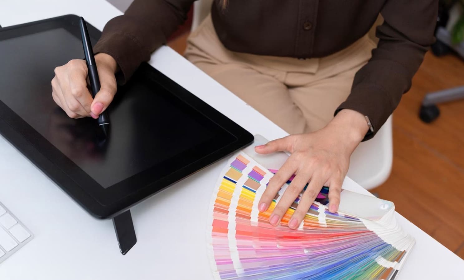
Invest in the Pantone Formula Guide
If you're serious about consistent brand colors, one of the first purchases you should make is a Pantone Formula Guide (the fan deck of color swatches). While it's an upfront cost, it's considered a bare minimum toolkit for any brand making physical products. These guides are ubiquitous in manufacturing; virtually every professional factory has a set. In fact, if a factory doesn't own a Pantone book, it’s a red flag about their professionalism.
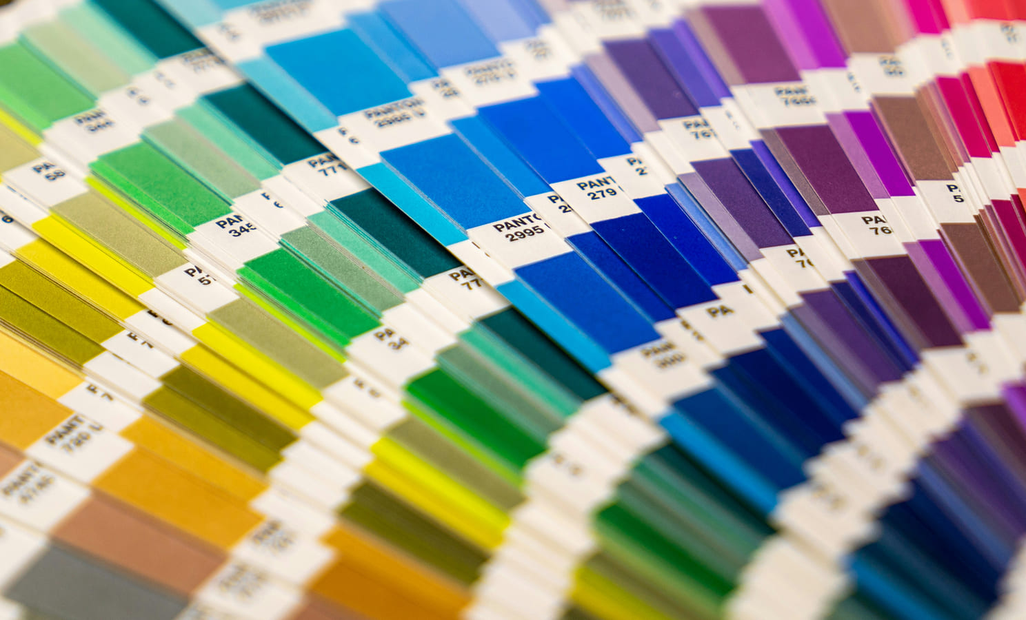
A key distinction is between Coated (C) and Uncoated (U) colors. Coated colors are printed on glossy paper, appearing richer and more saturated. Uncoated colors are on matte paper, appearing a bit duller. The same ink looks different on a slick box versus a rough tag or cotton fabric. Always specify the letter C or U, so everyone is looking at the correct reference material. As a rule of thumb, use the guide that most closely matches your material.
Defining Your Brand Colors in Pantone
Every brand should translate its core colors into Pantone codes. First, define your colors in RGB or HEX for digital use. Then, use online tools or swatch finder apps to find the nearest Pantone match. However, you must always double-check these suggestions against a physical Pantone book. Digital converters can get you in the right neighborhood, but they are not a substitute for a visual check.
Use the physical book to make the final call, then record those confirmed Pantone codes in your brand style guide. Your brand’s palette should list “Primary Brand Blue – Pantone 286 C,” alongside the digital HEX/RGB values. This gives anyone working on your products a precise, undeniable color reference.
Why Exact Color Standards Matter (Iconic Examples)
Consistency in color isn’t just about aesthetics, it's about brand recognition. Many of the most iconic brands can be identified by color alone. This is the power of nailing your exact hue every time.
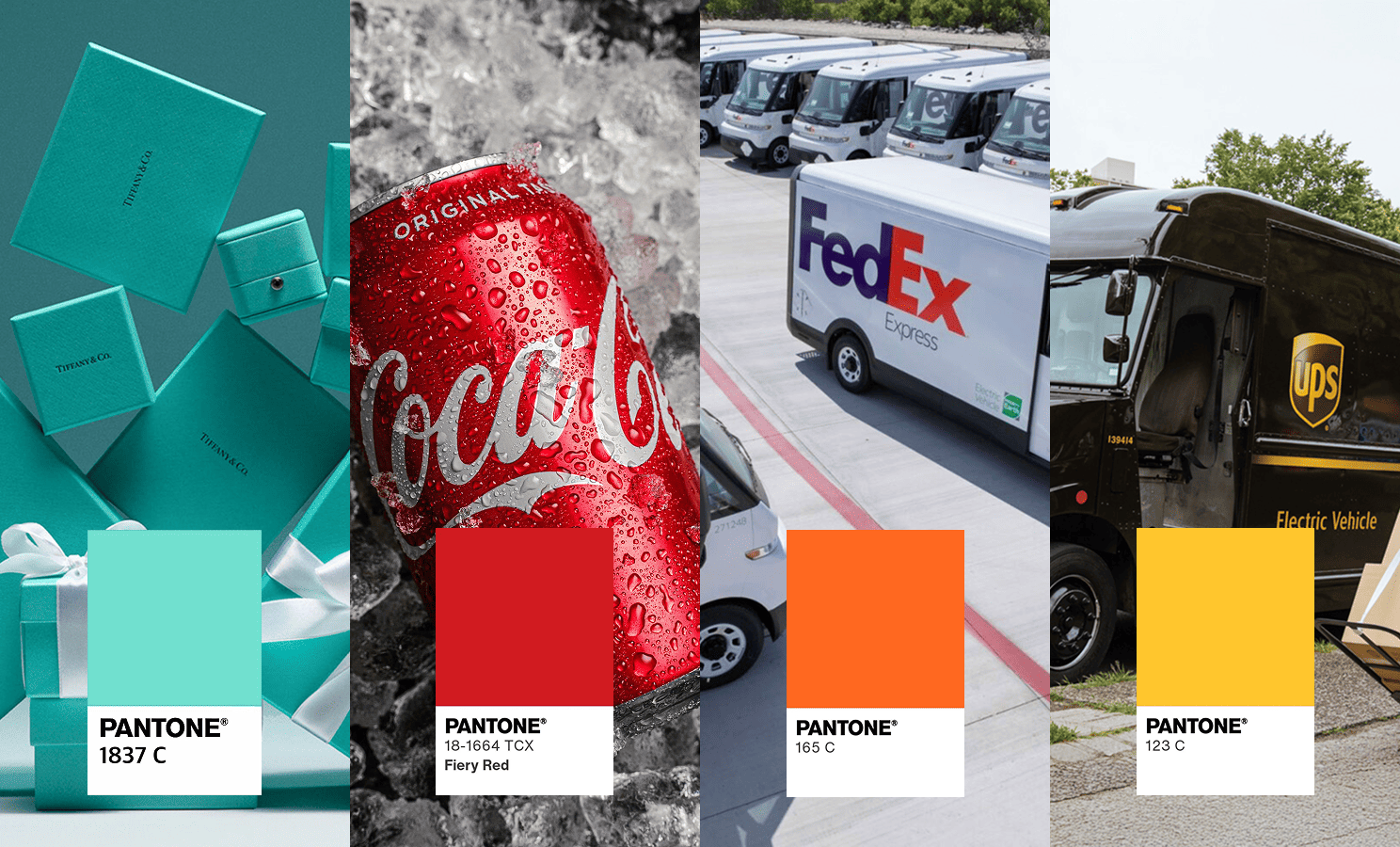
Defining and using Pantone standards ensures your brand's colors remain consistent no matter who manufactures your product. Over time, consumers come to recognize these signature colors as your brand, which is invaluable.
Specify Pantone Colors for Every Component
Once you've established your brand’s Pantone colors, carry that through to every product you develop. Any part of your product where color matters should have a Pantone reference. This is typically done in a tech pack, but it can also be communicated in your instructions or order brief.
For example:
- Body fabric: 100% polyester, Pantone 294 C (navy blue)
- Embroidered logo thread: Pantone 7548 C (gold)
- Woven label background: Pantone 294 C, text in white
Don’t assume the factory will match a logo thread to the main fabric. Spell it out. This extends to packaging and labels as well. This might feel obsessive, but it ensures a unified look and a cohesive brand experience.
Talk Color Early: Pantone Discussions with Your Factory
Before your factory makes a sample, have a direct conversation about color expectations. Confirm they understand which Pantone references you require and ask if they can source materials in those exact colors.
- Material Availability: For small runs, custom dyeing might not be cost-effective, so you might be limited to what's "in stock" in the market. Discuss this reality: Is the Pantone you want available in the material you need? A good factory will be honest and resourceful.
- Tolerance for Color Matching: Communicate how strict you are about the color match. Slight variations can happen due to dye lots and material types. If you require a perfect match, let the factory know upfront. But if you have some flexibility, communicating that might save time and money. Be reasonable and treat your factory as an ally.
Proofing Samples: How to Verify Color Remotely
The moment of truth is when the factory creates a sample. To verify color before the sample ships, you can:
- Request a photo of the material next to the Pantone swatch: Before assembly begins, ask your factory to physically place a Pantone swatch from their guide next to the sourced material and take a well-lit photo. This allows you to confirm the color and prevent the factory from wasting time and money on a product with the wrong material. This is a defined step in THE/STUDIO's production software.
- Request a photo of the actual sample next to the Pantone swatch: Once the sample is assembled, ask for photos of the product next to the Pantone swatch. Seeing it in a few conditions, like natural light and indoor light, can give you more confidence.
When the physical sample arrives, immediately compare it to your Pantone swatch in person. It should be as close as humanly possible. If you need to make an adjustment, document that change clearly with the factory before mass production.
Reorders: Don’t Assume the Color Will Match
A common mistake is assuming a reorder will match the original color exactly. This is rarely the case. Unless the raw material comes from the same dye lot as the original run, there will always be slight variations.
The rule is: don't skip the color confirmation step, even on reorders. At a minimum, ask the factory to send a photo of the raw material next to the original Pantone swatch. The level of rigor depends on your brand and order size, but for core brand colors, you should always treat it like a first production run.
Final Production: Documentation and Quality Control
Before mass production, all approved Pantone colors for every part should be locked in writing. This becomes the source of truth that the production team and quality control inspectors will refer to. You can request photos of random production pieces against the Pantone swatches to catch any batch-to-batch variation.
Finally, when the products are in your hands, you should be able to line them up next to your Pantone guide and see that they match the approved swatches. The beauty of the Pantone system is that it simplifies color communication and sets a measurable standard, bringing scientific rigor to a subjective topic.
With a relatively small investment in the Pantone system and a disciplined process, you ensure every product carrying your name is truly on brand.